Archive for the ‘graphs’ tag
Graphical Distortions
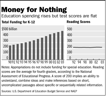
The side by side chart used in a Wall Street Journal editorial, “No Politician Left Behind: Lack of money isn’t the problem with education,” is a classic example of independent-scale graphical distortion.
Note first that the data on the spending is is not adjusted for inflation or the growth in the number of pupils. In theory, 500 is the maximum score on the NAEP scale-scored math and reading tests, but no student ever reaches this standard. The average score for high school seniors on the same scale is less than 300. I doubt Shakespeare would get near a 500 on the test.
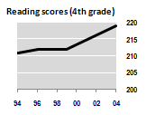
The fourth grade scores could have been scaled this way:
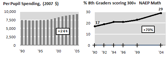
Including some more recent data, and using 8th math, we get quite a different picture:
but I’ll confess to some cherry-picking in my selection…
—
Gary M. Klass
Associate Professor
Department of Politics and Government
Illinois State University
Normal, Illinois 61790
(309)438-7852


