Archive for the ‘Ratios’ Category
Inscrutable Bar Graph
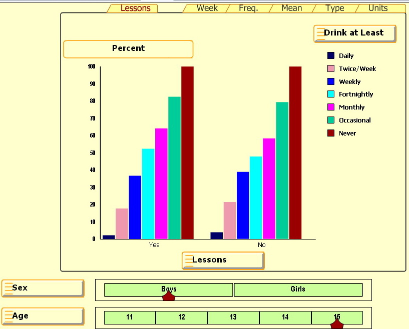
The UK Smart Centre has some great bar graphs involving alcohol usage by age and sex for kids 11-15. Press Start and select any of the five right tabs: Week, Freq, Mean, Type and Units.
But the percentage bar graph for the Lesson tab is inscrutable — IMHO 
One source of confusion is the cryptic “Lessons: Yes/No” heading at the bottom. Based on a related paper, Alcohol and a Mash-up: Assessing Student Understanding, it appears that some students had lessons on problems related to drinking (Yes) and some did not (No).
Since there isn’t much difference between the left and right graphs, it looks like the lessons didn’t have much effect on students’ drinking behaviors.
But the big source of confusion is the percentages. What are they percentages of? Notice that the “Never” group (the brown-colored bar on the right in each series) is always 100%. It seems that this Never group is the basis for comparison and all other groups are shown as a ratio or percentage of the Never group. With some effort we can figure out that about 30 percent of 15 year old boys who had lessons never drink. Can you see how?
But the real question is “Why bother?” Is there a reason this graph is so inscrutable? Or is there some way to read this percentage bar chart so it really does make good sense?
AP Misreads Percentage Table
10/22/09: The Associated Press (AP) released a story, Belief in Global Warming is Cooling, that said:
- 57% of Americans said [yes] there is solid evidence that the earth is warming [a 14 point drop from 2008]
- 36% [of Americans] said temperatures are rising because of human activity [an 11 point drop from 2008]
The AP also released this graph (AP ID: 09102201574) that described the 36% differently:
-
36% of those who answered yes, said temperatures are rising because of human activity.
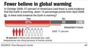
Now, 36% of 57% is around 20%. So according to this AP graph, only 20% of Americans said temperatures are rising because of human activity. This 20% would be big news if it were true. Both AP interpretations of the 36% came from this table.
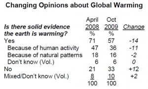
Source: Fewer Americans See Solid Evidence of Global Warming by The Pew Research Center for the People & the Press. Notice that this table is a multi-level percentage table: the percentages add to more than the totals and some of the rows are indented. Percentage tables are not always easy to read – even by professionals.
On 10/23, the AP released a second graph (AP ID: 0910222617) that deleted the 36% description used in their first graph.
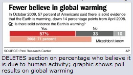
Did the AP make the right decision? What do you think and why?
AP Creates Bogus Crime Wave
On Sept 30, the AP claimed that 69% of candy-eating kids become criminals. Like most AP stories, this one appeared in dozens of papers. The only problem was this claim was false. Here is the Associated Press (AP) story:
AP: Sept 30 2009. Study says too much candy could lead to prison
LONDON, England — Willy Wonka would be horrified. Children who eat too much candy may be more likely to be arrested for violent behavior as adults, new research suggests.
British experts studied more than 17,000 children born in 1970 for about four decades. Of the children who ate candies or chocolates daily at age 10, 69 percent were later arrested for a violent offense by the age of 34. Of those who didn’t have any violent clashes, 42 percent ate sweets daily.
The AP single-handedly upped the violent crime rate for candy-eating kids from 0.8% in reality to 69% in their story. The AP has unleashed the tsunami of all crime waves.
This 69% bogus statistic was carried by MSNBC, CBS News, Fox News, Forbes, Google and Yahoo.
The AP statement is false and wildly so. Look at the numbers:
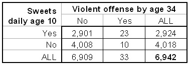
* Of the 17,000 children in the project, 6,942 fit this study.
* Of these 6,942 kids, 2,924 (42%) had candy daily at age 10.
* Of the 2,924 kids, 23 (0.8%) had violence convictions by age 34
Note the difference: 0.8% of candy-eaters arrested in the actual data vs. 69% of candy-eaters arrested in the AP story. Candy is not good for the teeth, but it hardly seems adequate to cause 69% of sweet-eating kids to become violent offenders by age 34. Once again statistical illiteracy strikes journalists.
So where did the AP get the 69%? From the original article. Here is the relevant piece:
Results: Overall, 69% of respondents who were violent by the age of 34 years reported that they ate confectionary nearly every day during childhood, compared with 42% who were non-violent.
Confectionary consumption in childhood and adult violence by Moore et al, The British Journal of Psychiatry, 2009 195: 366-367
The AP took the 69% ratio and switched part and whole. Compare the whole in the journal article with that in the AP story:
* Journal: respondents who were violent by the age of 34 years
* AP: children who ate candies or chocolates daily at age 10
The AP is guilty of confusing the inverse: P(A|B) = P(B|A).
If you need more detail, the journal article included this:
“The binary outcome variable, violence, is a rare event (0.47%)” “Observations n = 6,942.” Combining their results gives this table:
Q1. Should the AP retract their bad statistic?
Q2. Would most readers understand the difference?
